
App Store
2015-2017
Over the last three years, as Art and Creative Director at Moburst, I’ve been in charge of App Store design for various Google apps. I've worked closely with a number of product and brand teams on an international scale, and together with my team, have driven a huge increase in downloads.
It has been a huge privilege working on leading apps, many of which are positioned at the top of the App Store. It's very satisfying knowing that my team's creations are seen by millions of users all over the world, and a vital factor in their decision to download.
My Role
Employer
Client
Art & Creative Director
Moburst


App Store screenshots are much more than a way of listing an app’s features.
The space should be treated as an important advertising opportunity.
The goal is to engage potential users with relatable insights, tell a comprehensive story and display the app’s USPs in target audience’s language.
before

now

Google Maps
Google Maps is an amazing app and a must-have for any urban dweller.
In order to help the users understand the unique practical features the app has and to create a better connection, we localized the app design for different countries, embedding various landmarks in the continuous backgrounds.


Gmail
Our focus here was on the huge app update, and we wanted to show the new features in the most interesting way.
These screenshots were featured on hundreds of sites and blogs including Product Hunt.
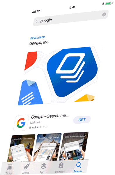
Google Search
Google Search is "the app that has all the answers". The concept was to present the app features using questions that are relevant in an urban narrative. It tells the story of somebody who's looking for a specific place and how they get there.


More Apps
Other apps I've worked on: